The graphical representation of information and data is called Data visualization. Data Visualization is a critical part of business activities since various companies nowadays are collecting a huge amount of data.
We can leverage Python and its data visualization library, which is matplotlib, to create several valuable plots and graphs. This Python module helps to use various visual elements like charts, graphs, and maps to plot the data in a visual format. This helps organizations to understand important trends, outliers, and patterns in data.
If you’re a machine learning or data science enthusiast, you must have heard the name “matplotlib” many times. Matplotlib is a comprehensive Python library that helps to create static, animated, and interactive visualizations. We can use this library for various data analysis tasks.
Matplotlib provides an object-oriented API for embedding plots into applications. It provides a wide variety of charts and graphs and makes everything easy for us.
In this article, we will learn the basics of this Python module by plotting some charts and graphs.
Installation
I’m using a jupyter notebook for this tutorial. If you don’t have one, you can install it using these guidelines. Also, make sure you install matplotlib in your system. you can do it in three ways.
If you have an Anaconda navigator, you can do it using the GUI itself. Otherwise, you can install it using either of the following commands (for Anaconda prompt and command prompt respectively).
conda install matplotlib
pip install matplotlib
Use pip3 instead of pip if you’re using a Mac or Linux.
Plotting a Basic Graph
Open a new notebook using the Jupyter notebook software.
First things first, we’ll import the numpy module and the matplotlib module into our notebook. We don’t need the whole matplotlib library as of now. So, we’re importing only one part of it, which is pyplot.
If you don’t know numpy yet, check out this tutorial that I’ve made. Numpy is really important in all the numerical operations that you’ll use. With that said, let’s proceed with matplotlib.
Note that I’ve used %matplotlib inline here. This is because I want to see the output or the plots inline. If you’re not using a Jupyter notebook, you can ignore this line.
Now, let’s create a simple linear graph. We’ll have two variables, say x and y. We’ll create two linearly spaced vectors using the linspace method.
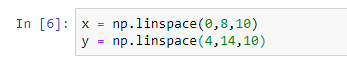
linspace(0,8,10) generates a vector of 10 points between 0 and 8. Similarly, linspace(4,14,10) generates a vector of 10 points between 4 and 14.
Now, let’s plot the two vectors on a graph using the plot() method.
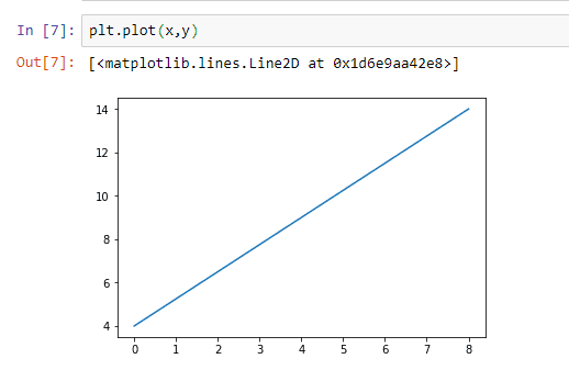
This graph helps us to understand the relationship between x and y.
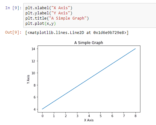
Now, if you want to add some more details to this graph, such as a title, axis labels, etc., you can do that as well. Now, you’ll get a more detailed graph.
Now, if you want to create a bar chart for showing the information, we can use the bar() method to plot one.
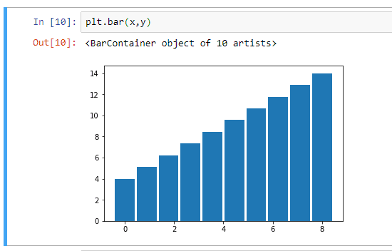
You can logically use this according to your wants.
Histograms
We can create histograms using the matplotlib module. A histogram shows the frequency on the vertical axis, and the horizontal axis is another dimension. It can be used to filter out the number of instances from a particular set of data.
A histogram has bins, which are containers, where each bin has a minimum and maximum value. Each bin also has a frequency between x and infinite.
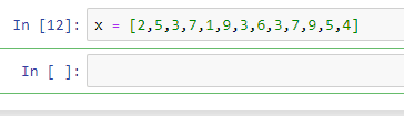
For example, let’s consider a variable x with a lot of values.
Now, let’s say we want to know how many values are repeated and the frequency of each value.
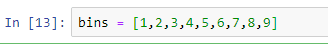
We’ll define the bins, which are values from 1 to 9.
Now, based on these two arrays, we can plot a histogram, which makes sense. We can use the hist() method for plotting the histogram.
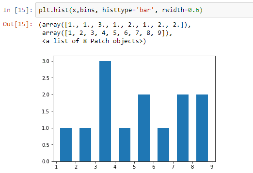
Here, I’ve used two extra parameters, which are histtype and rwidth. The former makes sure that we’re plotting a bar chart histogram, and the latter sets the distance between individual spikes.
This graph shows that the most repeated number is between 3 and 4. It’s actually 3.
Pie Charts
We use pie charts to show the size of items (called wedge) in one data series, proportional to the sum of the items. The data points in a pie chart are displayed as a percentage of the whole pie.
Now, let’s create an example data set and display a pie chart.
Let’s say we have a lot of ice cream flavors available in our ice cream shop.
We have 10 kg of vanilla ice cream, 7 kg of strawberry ice cream, 8 kg of butterscotch, 6 kg of tender coconut flavor, and 3 kg of mango flavor. We’ll plot the figures in a graph.
First of all, we’ll create an array to represent the kg of each flavor.
We will create another variable to represent the corresponding labels.

Now, we’ll create one more variable to represent the corresponding colors.

Now, let’s plot the pie chart showing the percentage of each ice cream flavor left in our shop. We can plot it using the pie() method and passing the required parameters.
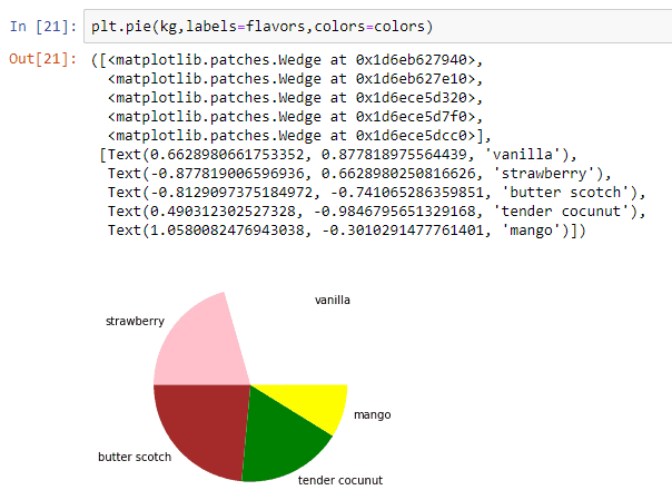
As you can see, we get a beautiful pie chart showing the necessary data that we want.
The Next Steps…
I hope you understood how simple it is to use matplotlib and plot various types of graphs and plots. Matplotlib is a pretty easy library to learn. You can use these graphs or plots in your projects and research paper works.
I just gave you the fundamentals of this marvelous module. If you want to learn more about matplotlib, you can visit the official documentation page where everything is available.
If you’re not nerdy enough to read the documentation, I’ll put a video tutorial below that will help you to learn more. If you’re interested, check out the following video.
I hope this article was helpful. If so, let me know in the comments section. Also, feel free to ask your doubts or queries if you have any.
I would appreciate it if you would be willing to share this article. It will encourage me to create more useful tutorials like this.
Happy Coding!
2 thoughts on “Data Visualization in Python Using Matplotlib”
Leave a Reply to Eugene Scharf Cancel reply
Recent Posts
Modular programming is a software design technique that emphasizes separating the functionality of a program into independent, interchangeable modules. In this tutorial, let's understand what modular...
While Flask provides the essentials to get a web application up and running, it doesn't force anything upon the developer. This means that many features aren't included in the core framework....
")
thank you for the explanation
can you make an animation that demonstrates a line or curve that changes with time function?
ie
t1; x = [2,3,4], y = [6,8,10]
t2 x = [3,4,4], y = [5, 9, 11]
t3…
and then play the whole animation to see how the line moves with time?
any insight would be more than appreciated
Good job